The Basics of Editing Photos on your Smartphone
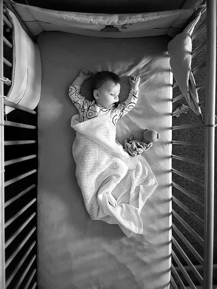
So you’ve started getting some nice photos with your new smartphone and you’ve grown tired of slapping another insta filter over them.
Well how lucky you ended up here then to discover some simple tips and techniques editing your colour and Black & White photos.
Starting with Apps to use, we’ll run through helpful tools like Tuning, Healing, Rotate/Cropping, Vignette, Black & White and show you how to use them. Lets get into it…
Apps to Use for Editing
I’m a huge fan of Instagram but I recommend you do your editing outside of the app (this goes for other social media apps too) and share from the editing app to your favourite social medias. There are plenty of options of apps for editing on the go but I can only really suggest what I’ve found best so here are three options for you.
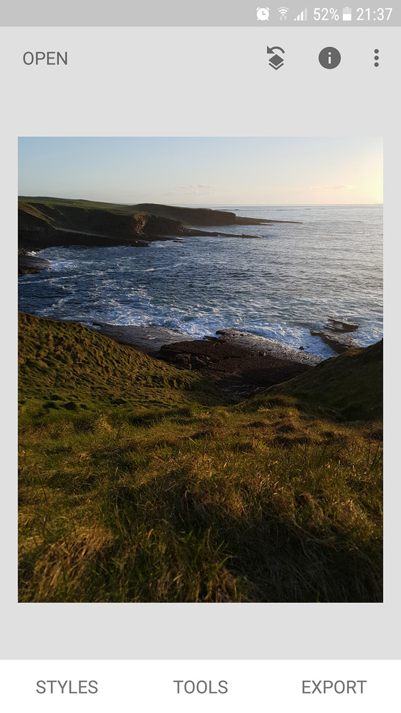
Snapseed – I’ve used this app for a few years now and it is my go to app for pretty much any type of photo. Each of these apps have similar photo ‘tuning’ tools but I find Snapseed to be the most straight forward and once you know the options you want I find it the quickest app to use. This will be the app most (or all) of these tips will be based on but they can be applied to any of the others below also.
Photoshop Express – This app is another very popular one and along with Snapseed offers all the simple editing tools you need along with plenty of others. I like this app but for me I find navigating Snapseed for the effects/tools I want a bit quicker and clearer.
VSCO – Again like the above apps VSCO has all the basic tools you need and more, what really sets this one apart though is that the app is also a community/social network in itself. The app emulates actual film types to give a ‘film’ look to your digital photography and although the two above can do the same thing, this is superior at this in my opinion. I don’t usually go for that look too often so I rarely use the app itself. The main downside of this app though is that you need to sign in to use the app itself whereas the two above you don’t.
Take Better Photos
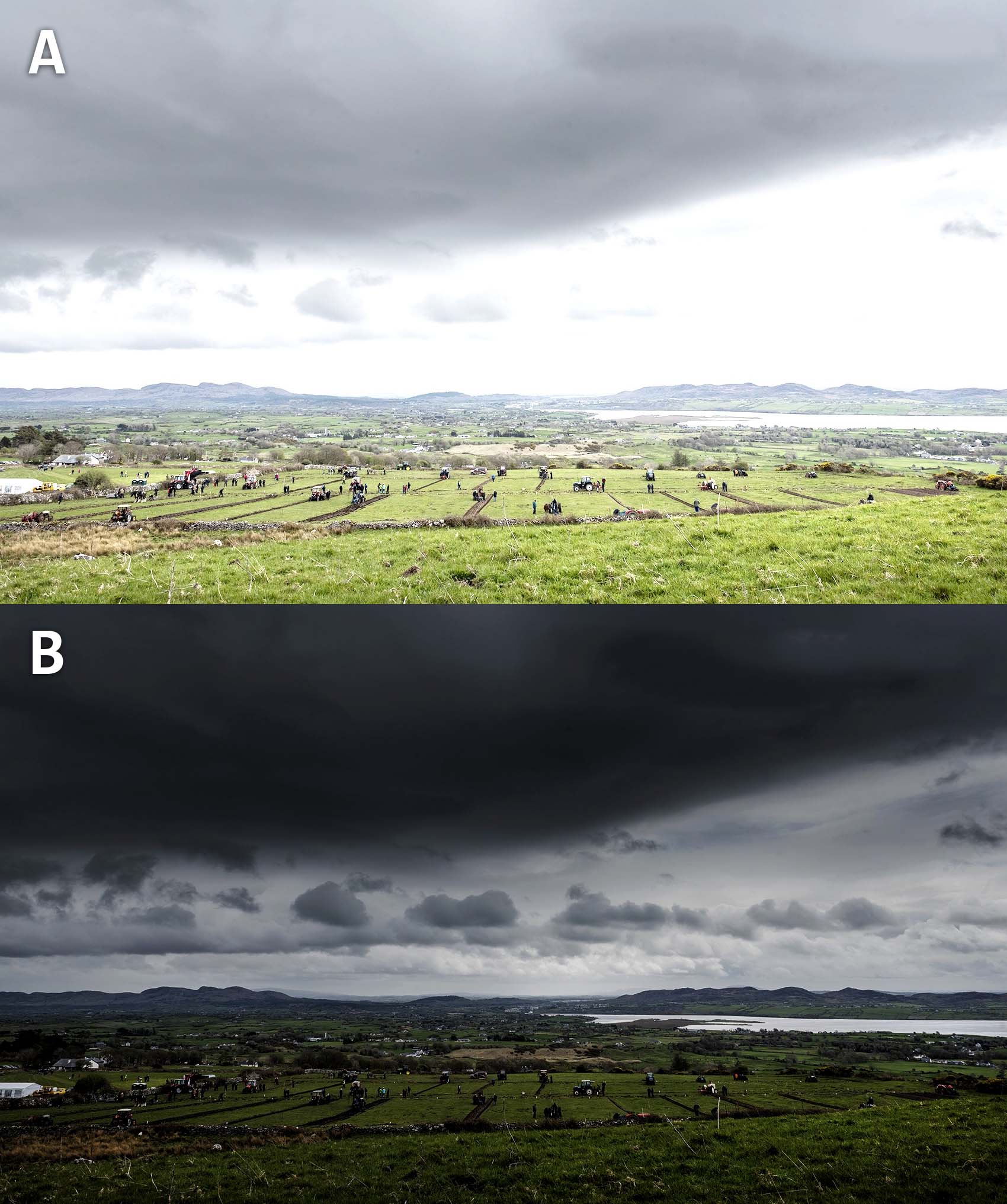
This one might seem obvious but let me explain. Firstly if you missed my last blog on how to take better photos with your phone make sure to check it out if you’re a beginner.
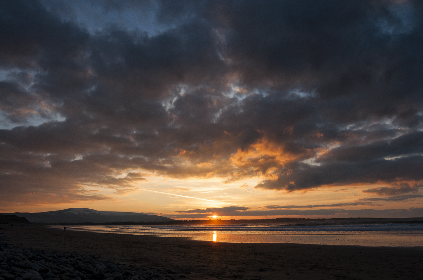
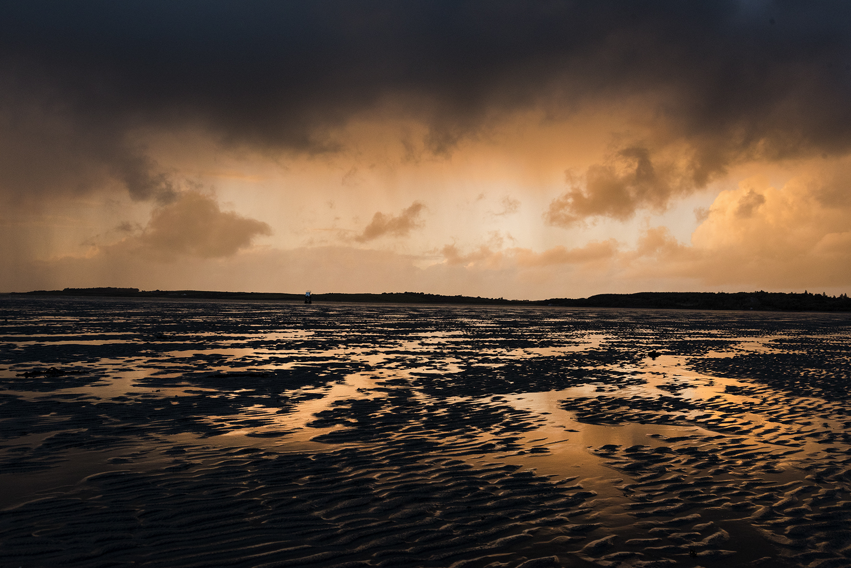
So, by ‘better photos’ what I really mean is better exposed photos, photos that aren’t over exposed (like Photo A) or under-exposed (like photo B) and also better composed images in general.
If you over expose your photos (Photo A) you’ll lose information in areas that are blown out (The sky to the right between the cloud and land is missing detail), you’ll want to try your best to expose those parts as you can brighten darker parts of a photo but you lose the blown out areas. Try to find a balance and expose the bright area but don’t go too dark (Photo B) that your under-exposing a focus of the photo. Below you’ll see a more balanced exposure of the photo.
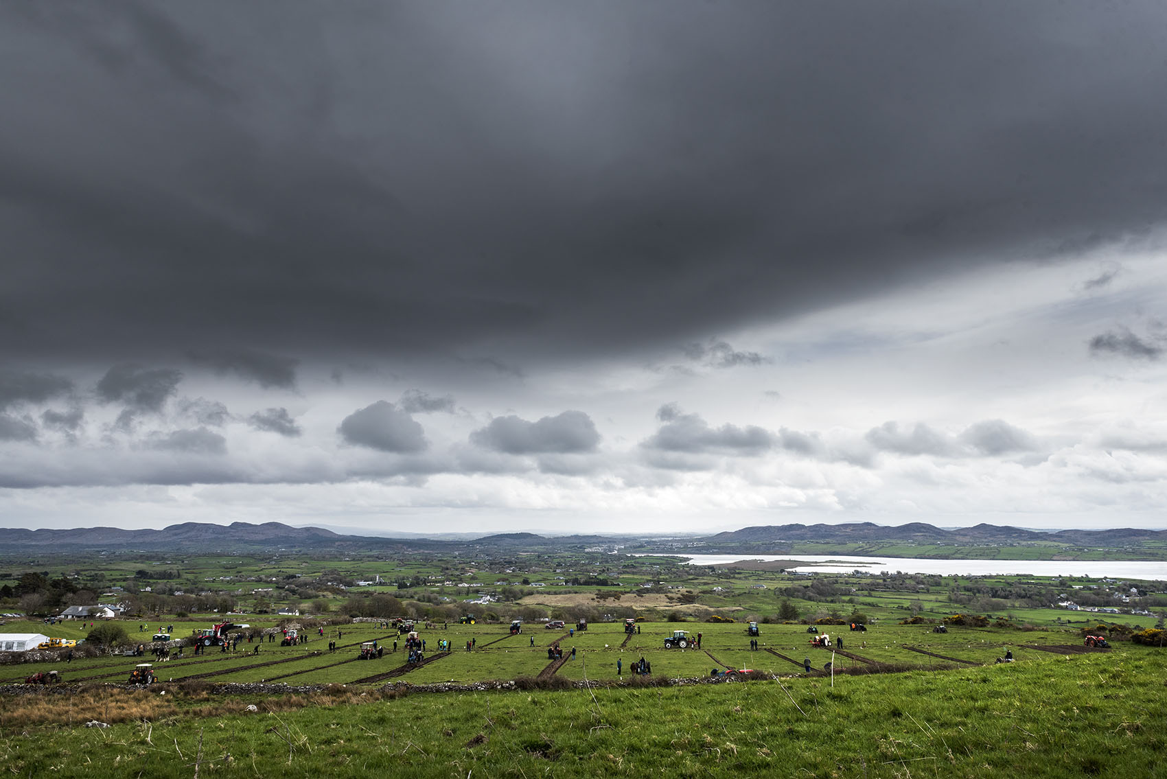
If you’ve read my last post you’ll also know that composition is something I feel should never be under-estimated and immediately makes your photos more pleasing to the viewer’s eye. Even straightening a simple crooked photo or cropping for a better composition (Rule of Thirds) can improve your photos greatly.
Use your apps rotate & crop tools and although Instagram likes square photos I find it restricts your compositions so I stick with landscape or portrait orientations.
This is where the magic happens and where you can really bring your photos to life. Explore these settings and see what happens when you pull the sliders all the way to 100 and back to 0. My advice is to use small increments when it comes to editing, don’t push your image too far or you’ll have blocky pixels, over or under-exposed areas and it’ll begin to look like nasty.
Below I run through a few of the more important options you have at your disposal to ‘tune’ your photo.
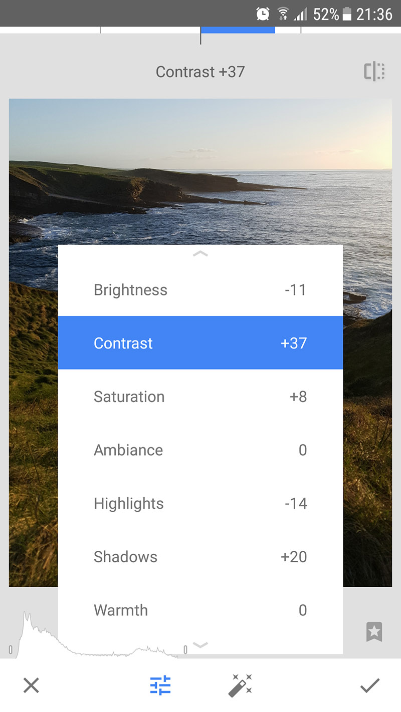
Brightness (or exposure) – What it says on the tin, this adjusts the overall brightness of your photo.
Contrast – The more contrast in your image, the more noticeable the difference between light areas and dark areas. See photo A which is flat (before contrast) and B which has contrast added. Depending on the photo you might want to add some contrast to make the photo pop or in some cases if your photo already has high contrast light then you won’t need much contrast added in editing.
Saturation – This is an adjustment that is often over done, be gentle and don’t over saturate your image. Start with a little saturation (5-10%) and slowly add to it.
Shadows/Highlights – These two are usually separate settings and what they do is either dull the highlights in your photo or brighten the shadows to recover detail. These can be handy to use if you have an especially dark photo and you want some detail in the darker areas.
Sharpen – Again this one is straight forward, sharpen sharpens and it’s usually a strong sharpen effect so go easy or your photo will look too hyper-real. There is also ‘Structure’ which is another way to get definition in your photo but like sharpness small amounts work best.
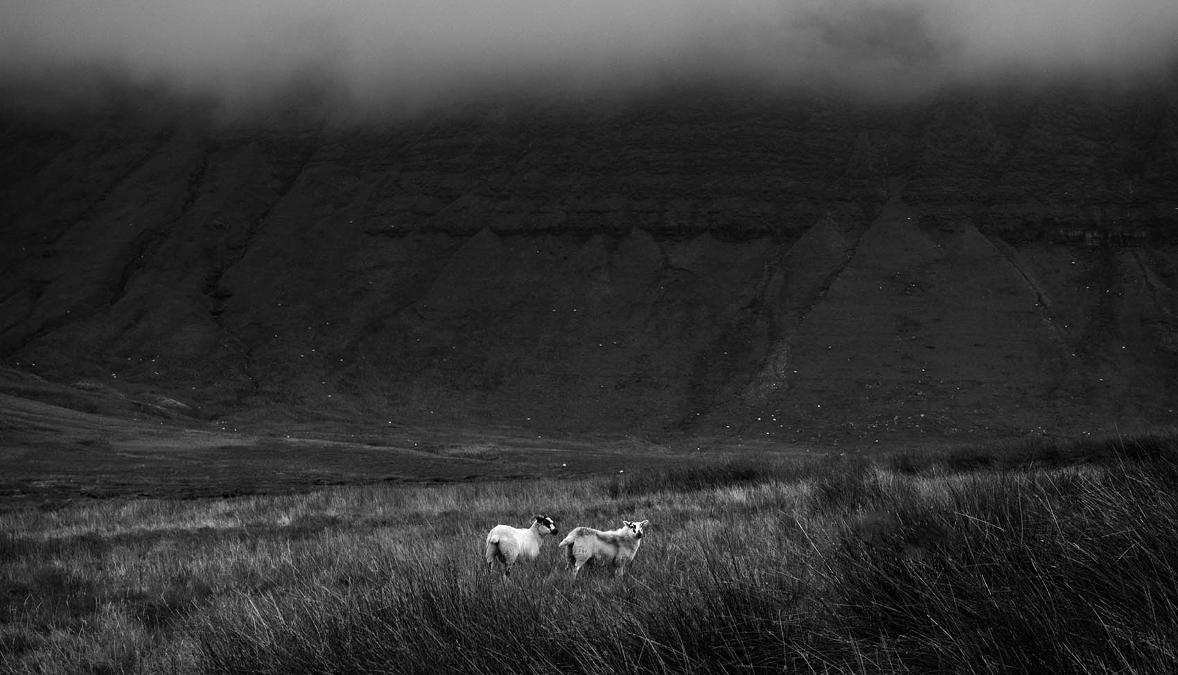
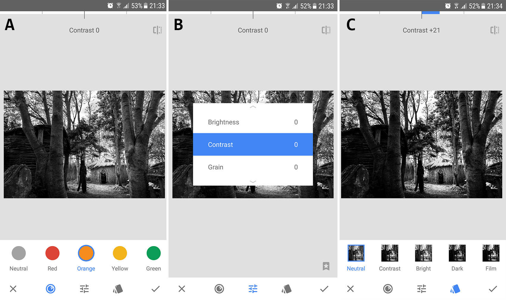
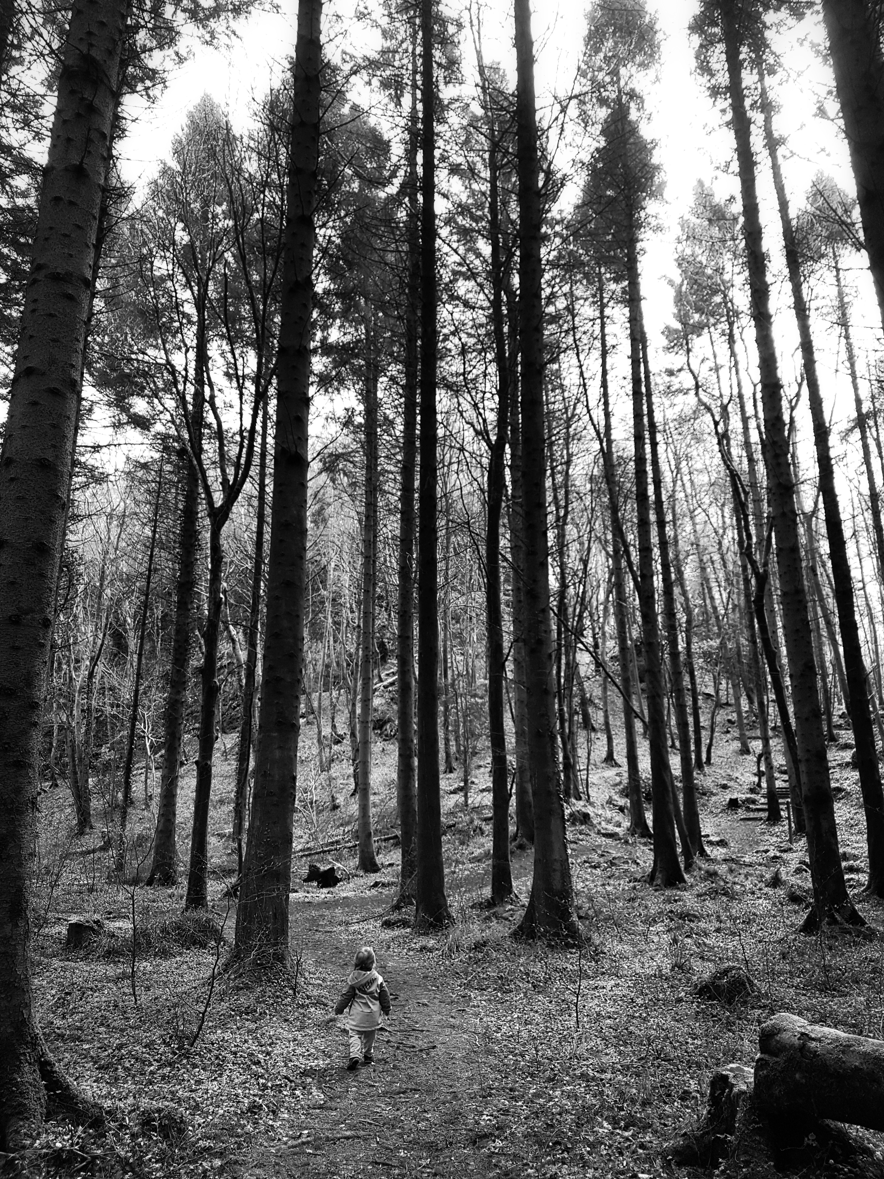 In Snapseed you have a Black & White option in Tools, select it, then your photo is turned B&W and you can make a few alterations to it. At the bottom of the screen you have three symbols that are (l-r) Colour Filter, Tune Settings & Pre-sets.
A. Each Colour Filter will change how colour appears in a photo, this means your B&W will look different when processed. For example when you use red (or Orange or Yellow to varying degrees) on a blue sky it will darken the sky in the B&W image. Play around with these on different photos to see what looks good to you.
B. Tune Settings gives you Brightness, Contrast & Grain. The first two we’ve covered above and the third is worth forgetting in my opinion 😉
C. Pre-sets are basically pre-set filters that you can select and then change the Colour Filter or Tune Settings after. Try a few and it might give you an idea of how to get the B&W effect you like.
When happy press the little tick in the bottom corner and you’re B&W is cooked!
One final note on B&W is that not all photos are necessarily ideal for turning to B&W, look for contrasting patterns, textures and angled light on subjects. Like with all this, you learn through experimenting so go out there, take some photos then put your feet up and play around with these effects.
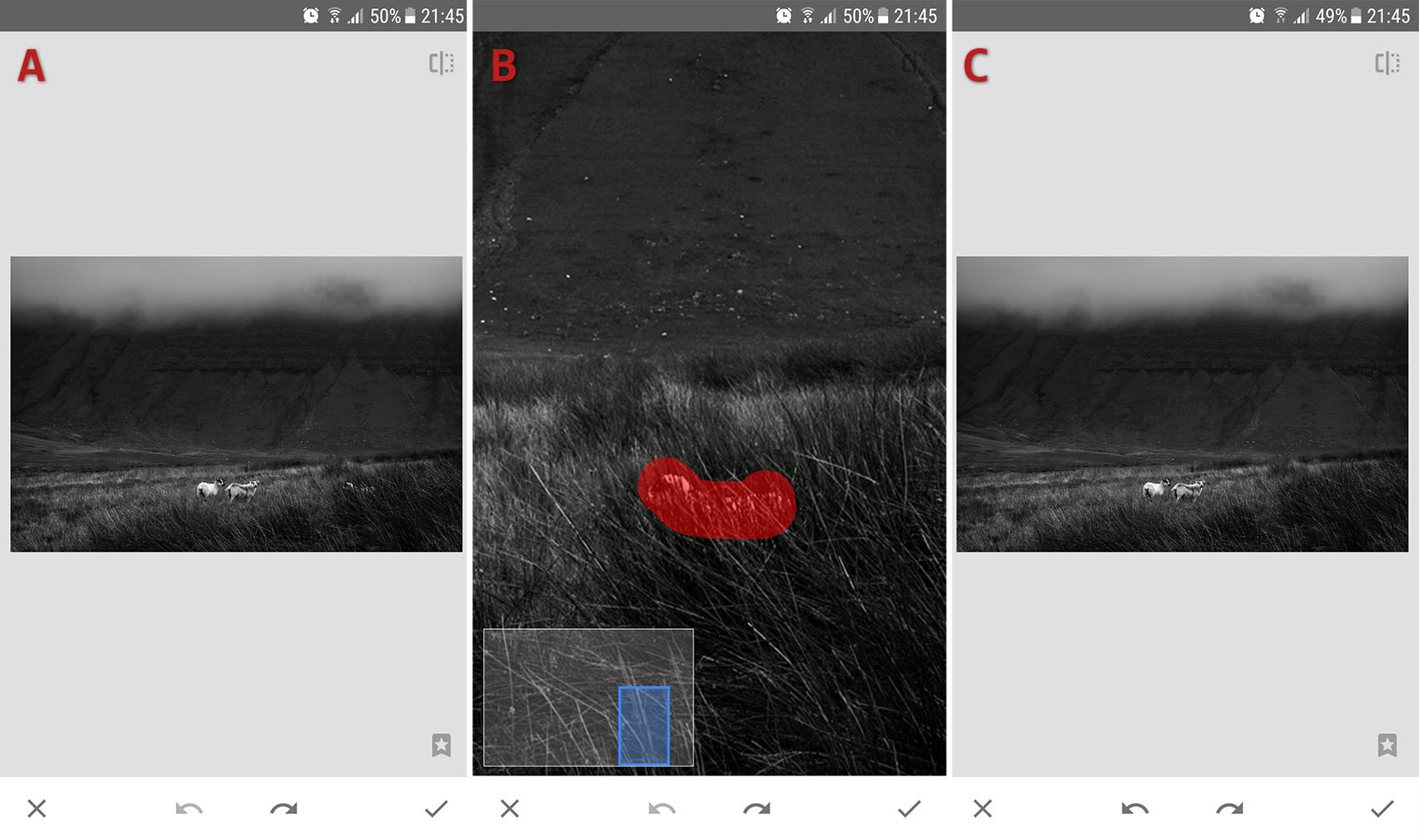
This is a handy little function to remove any small items from your image and it’s pretty good at it too (not perfect but it’s on a phone!). If there are people in the background of an image you can zoom in by pinching and then just highlight with your finger what you want removed (B) & Done!(C)
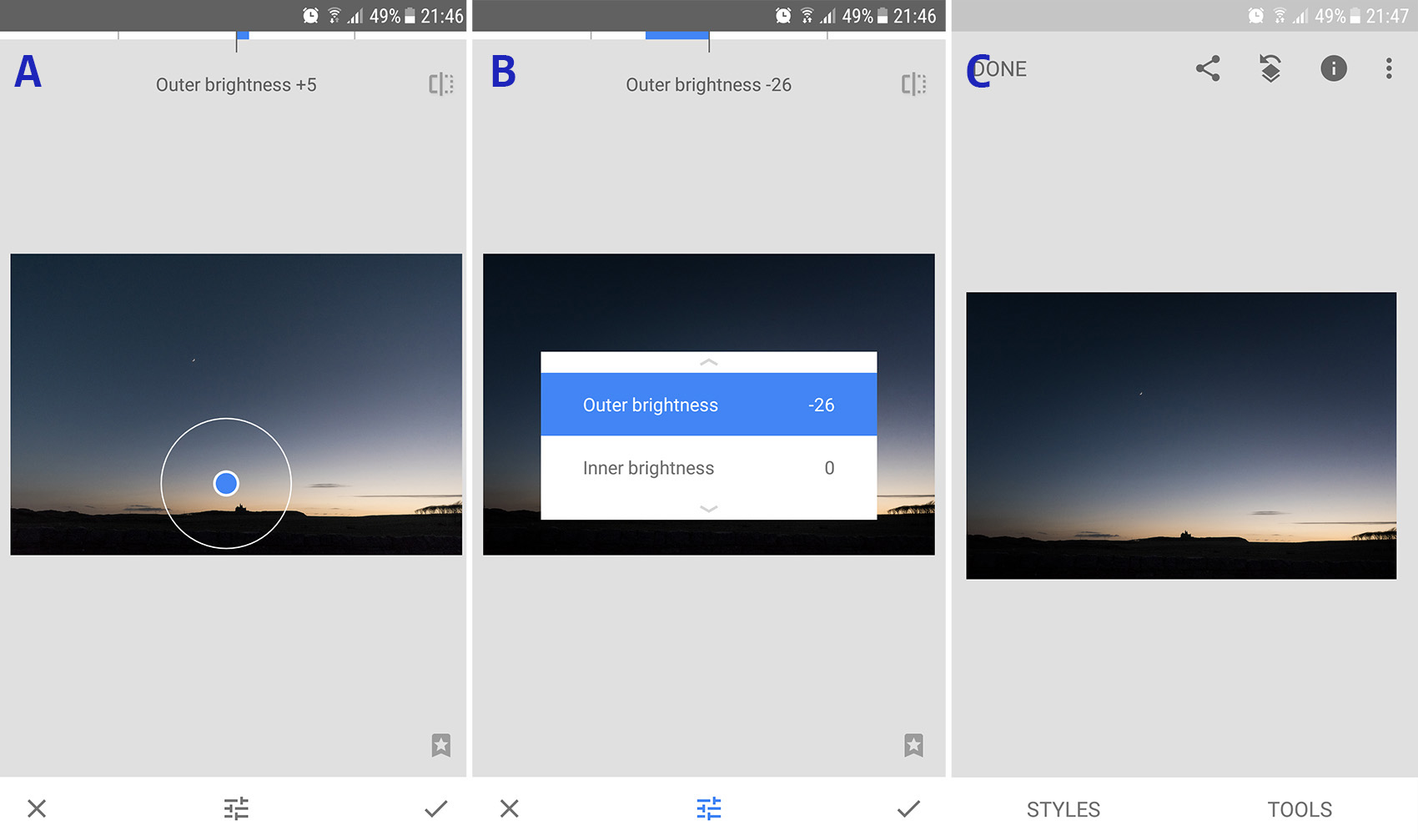
I use this quite a lot, select Vignette and you can move your circular vignette around (A), pinch to change the size and drag your finger up or down to swap between controlling the inner or outer brightness (B). Drag left or right to control how bright or dark you want it. This can be useful to dull parts of your photo in order to highlight the brighter areas.
When your happy with your edit then just hit Export/Share/Save/Publish. Done!
Thank you for looking,
Now go grab that shot and have fun editing.
